
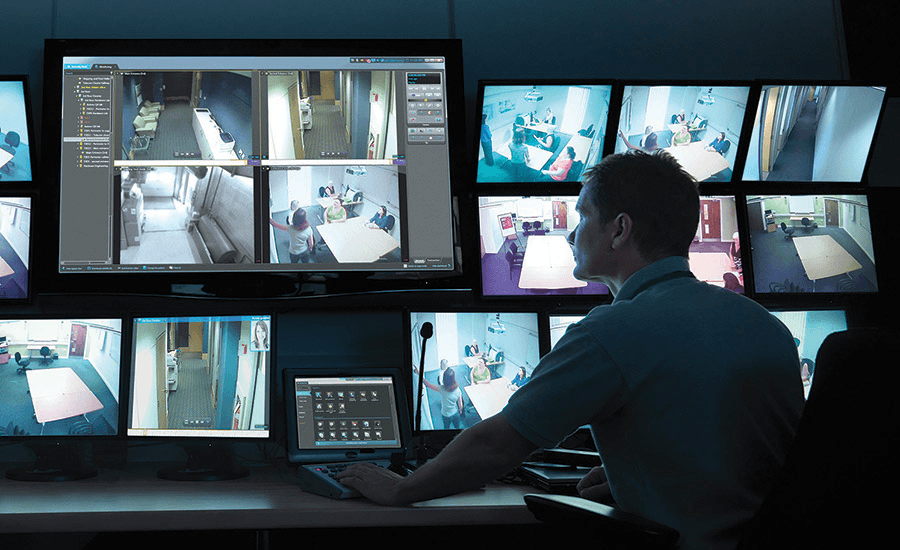
Genetec stands as the global leader in Video Management Systems (VMS), empowering over 41,500 customers worldwide to "Protect the Everyday." Their flagship platform, Security Center, enables security professionals to monitor, review, and analyze video footage across multiple cameras and locations. Used across diverse industries such as airport surveillance, citywide camera networks, retail loss prevention, campus security, hospital safety, stadium monitoring, and critical infrastructure protection.
👤 My Role
I was tasked with improving the archive search functionality within the Monitoring task section of Genetec's Web App. As one of seven UX Designers at Genetec, I served as the primary designer for this feature. At Genetec, each feature is ideally assigned to one lead designer to ensure focused ownership and clear direction. However, due to the ratio of developers to designers this is not always possible.
As the primary designer for this feature, my responsibilities included:
Leading the UX/UI design process from initial concept to final implementation
Collaborating with the Gelato design system team for new component approval
Coordinating with UCS team for consistent microcopy
Validating design decisions with stakeholders
Innovating on existing solutions while considering technical constraints

🤔 Initial Request
The project began with what appeared to be a straightforward request from the Development Lead: improve the time selection in the archive search function by allowing users to select a specific second rather than limiting them to 15-minute intervals. During our initial kickoff meeting, she explained that this limitation had become increasingly problematic for security professionals conducting investigations.
Userflow
To properly assess the problem, I first needed to understand how users currently interacted with the archive search functionality. The existing flow consisted of three main steps:
Step 1
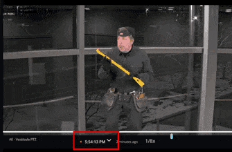
First, users would click on a chevron icon located near the "Live" indicator in the video monitoring tiles section. This was their entry point to accessing archived footage.

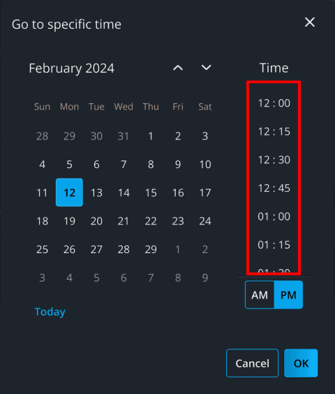
Step 2
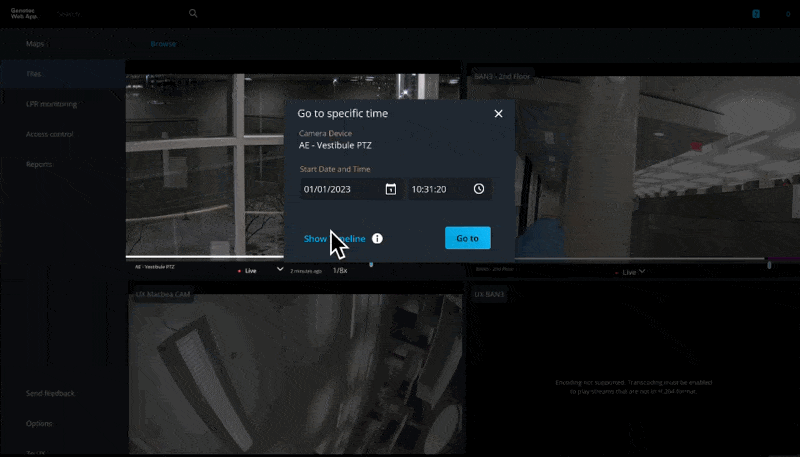
Next, a modal would appear allowing users to select a date from a calendar view and a time from predetermined 15-minute intervals. This was the problematic step where users lacked the precision needed for many security scenarios.
Step 3
Finally, after selecting a date and time (limited to those 15-minute intervals), the system would display the archived video from that timestamp. However, sometimes users would then need to manually scrub through the footage to find the exact moment they were looking for. This could be a tedious and time-consuming process.

🔍 Quick Solution
I explored two potential implementations using pre-existing components from our design system:
Version A: Three separate numeric inputs for hour, minute, and second
Version B: Using our existing time input component but including seconds.
Version A

Version B
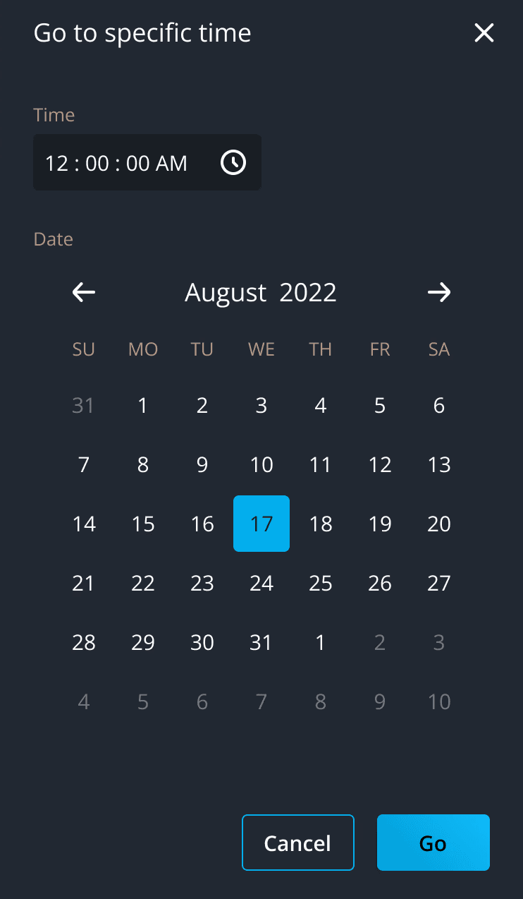
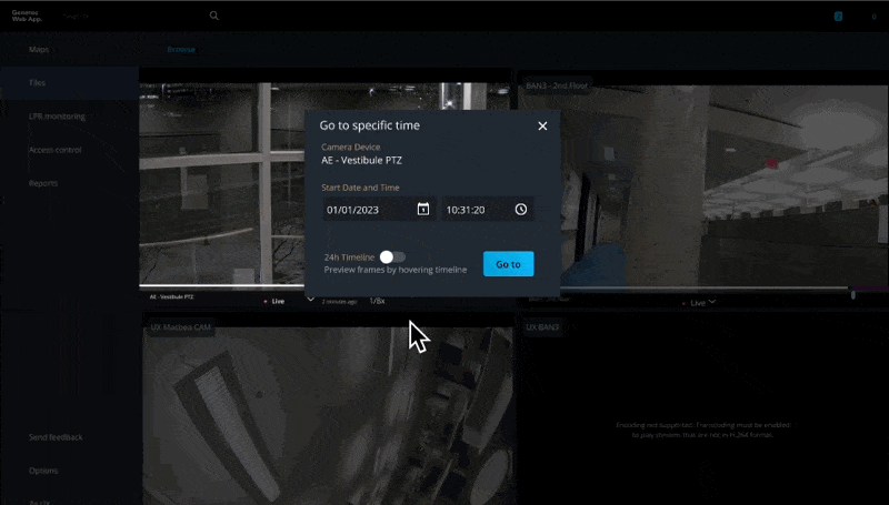
After consulting with the Gelato Design System team, Version B emerged as the winner for the quick solution. Although the time input with seconds precision wasn't officially a variant in our design system, it had been implemented in other parts of the application and could be re-used.
But it doesn't stop here... I felt there was more to the problem than just timestamp precision. Before meeting again with the PM and Dev Lead, I wanted to explore potential improvements that could truly transform the user experience. As a UX Designer, my role extends beyond solving UX bugs. We need to advocate for users and help shape the product roadmap with their fundamental needs in mind.
Understanding the Bigger Picture
My first step was to consult with our UX Researcher to gain more context about the security professionals who use our system. While I had a general understanding of our users, I needed specific insights into how they interact with archived footage in their daily workflows. This additional research revealed crucial insights about user behaviors and pain points that weren't captured in the original feature request.
Key User Personas
Through collaboration with our UX researcher, I identified three primary personas who interact with archived footage:


From analyzing these personas, two distinct usage scenarios emerged:

This 2nd scenario proved to be a higher occurrence than anticipated in the personas' workflow. Improving this could potentially save hours every week.
False Positives
While not a direct competitor in the enterprise security space, this GIF of Ring's consumer security app revealed a universal challenge in security footage which is false positives in motion detection.
The GIF shows a nighttime scene where a cat triggered a motion alert. In a professional security context, these false positives become a significant pain point when multiplied across dozens or hundreds of cameras. They can even be triggered by strong winds.

Reframing Problem Statement for Scenario 2
With deeper insights from user research, I could now properly articulate the 2nd scenario's problem statement. While the 1st scenario's problem was straightforward (inability to select specific seconds), the 2nd scenario revealed a more complex challenge:

This problem statement captured several key pain points:
Needle in a Haystack Challenge - Security professionals often need to find specific moments within vast amounts of footage, sometimes spanning days or weeks.
Time Pressure - During investigations, time is often critical, yet the current system forced users to manually review large sections of footage.
False Positives - Motion detection and other automated flags often highlight irrelevant footage (animals, shadows, weather), leading to wasted time.
Cognitive Overload - The mental strain of constantly evaluating footage for relevant activity causes fatigue and reduced effectiveness.
Changing the Roadmap
After pitching to solve the 2nd scenario and secure stakeholder buy-in, we updated the project roadmap to accommodate a multi-iteration approach, transforming what began as a simple UX bug into a comprehensive feature for archive search.
🧑🏽🔬Research
I turned to Genetec's Desktop client (Security Center) for inspiration. Being one of the first software products Genetec developed over 15 years ago, it had tackled similar challenges with well-thought-out features despite its classic UI.
I found a comprehensive YouTube video: Genetec Security Center 5.10 Overview and Demonstration by Phil Coppola, a Physical Security Professional.
This resource proved invaluable as Phil demonstrated actual workflows with realistic data, providing a window into how security professionals interact with video archives. While the official documentation explained the features, watching an expert navigate the system with realistic dummy data helped me empathize better with users' actual experiences and challenges.
Video Archives Modal
The Video Archives modal showcased in the desktop client provided a much more robust solution than our current "Go to specific time" modal in the Web app. It offered two distinct views for exploring video archives, each with specific advantages:
1st View: Timeline
The timeline view provided a powerful visual overview of an entire day's worth of recordings, making it easy to identify periods of activity at a glance. This feature was particularly valuable for security professionals needing to quickly scan through vast amounts of footage.
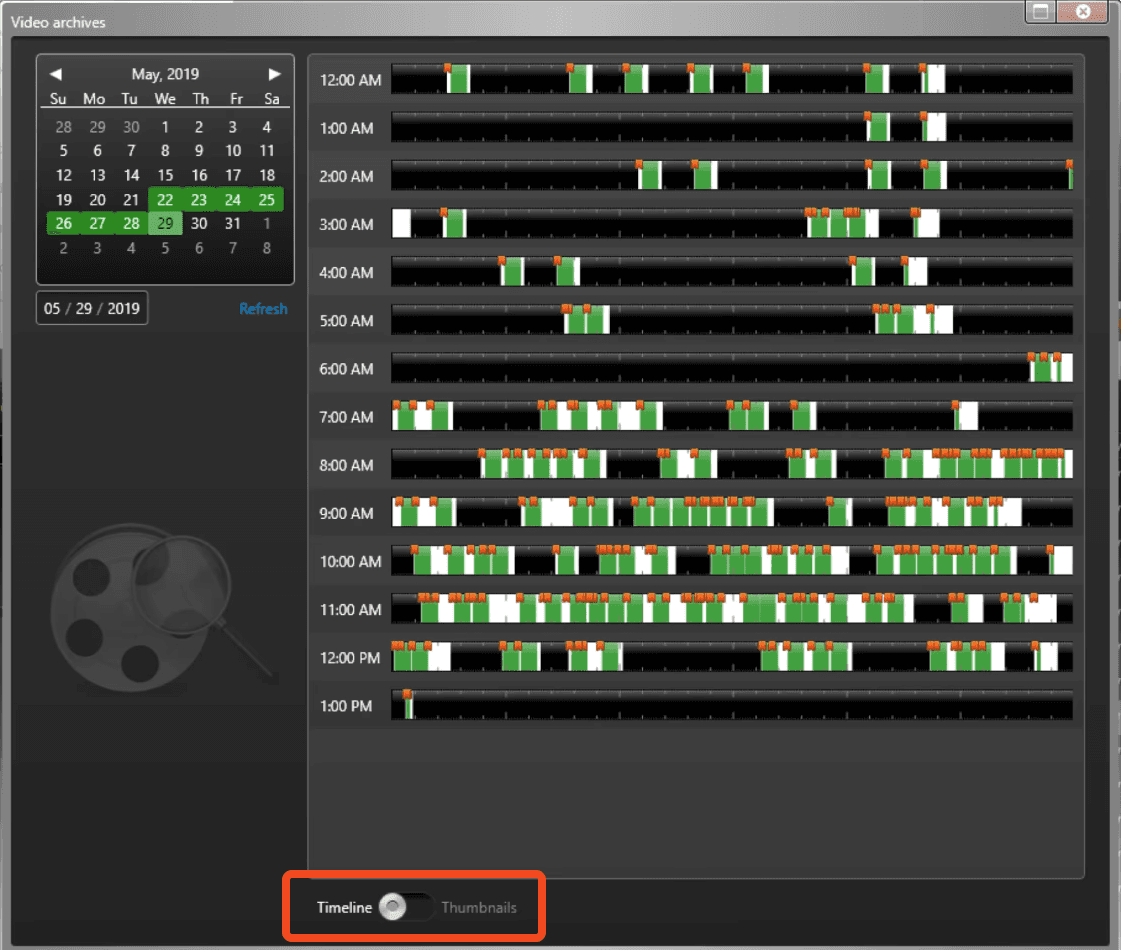
White bars indicating where recording was present
Green bars showing motion detection (with larger bars representing more motion)
Orange bookmarks for user-flagged moments
What caught my attention was the easily overlooked toggle at the bottom of the modal (highlighted in red). This subtle UI element allowed users to switch between Timeline and Thumbnail views. Many users might miss this powerful feature due to its placement.
2nd view: Thumbnails
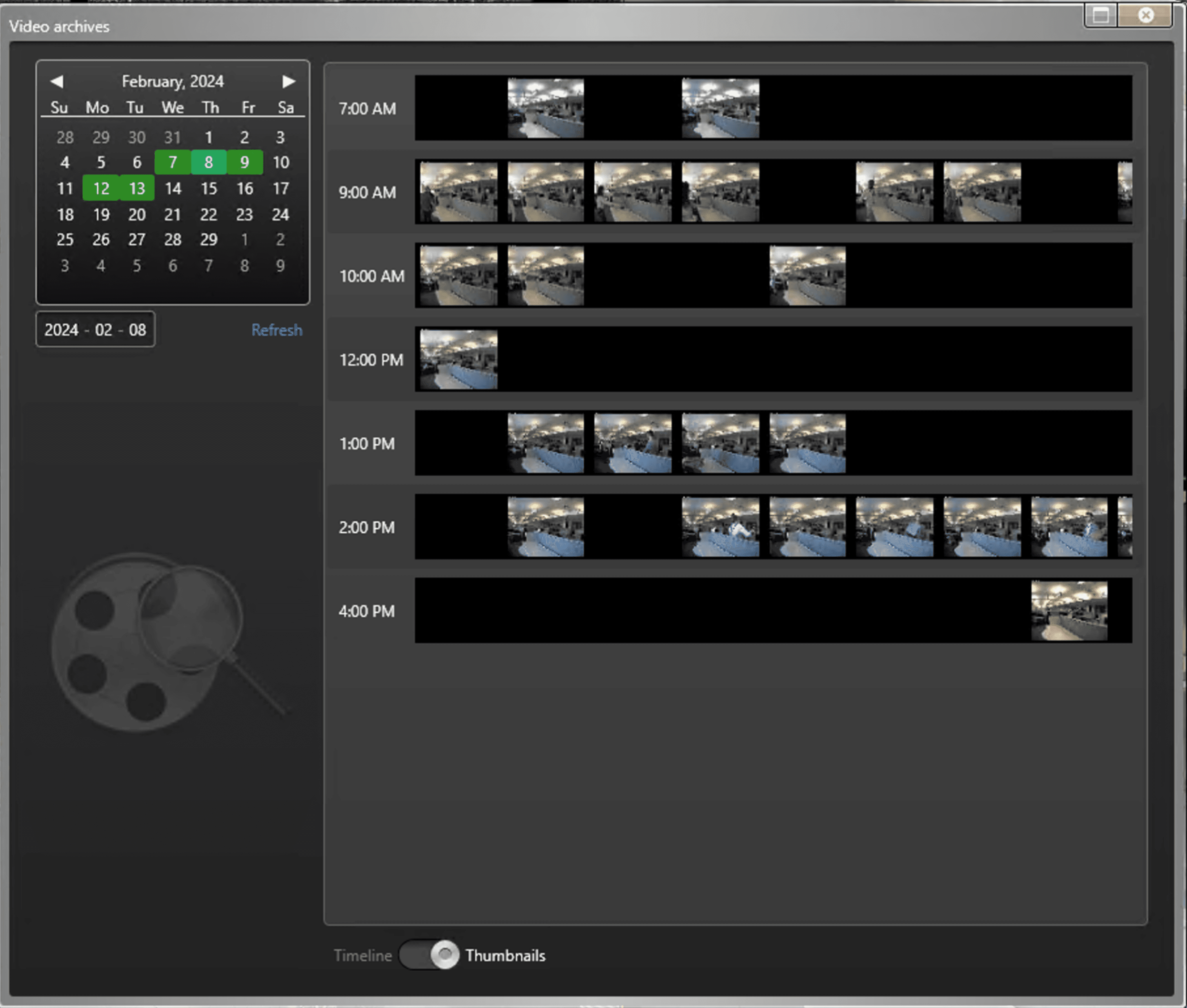
By having the default view being the Timeline view with the Thumbnail view as secondary, there is less cognitive load in timeline view than thumbnail view. As it's harder to differentiate between similar looking frames, but it provided critical visual context that could help identify specific moments of interest.
Version 1
Wireframe
I began with wireframes to quickly explore layout options and interaction patterns. The wireframe focused on the core structure: combining precise time selection with visual exploration tools.
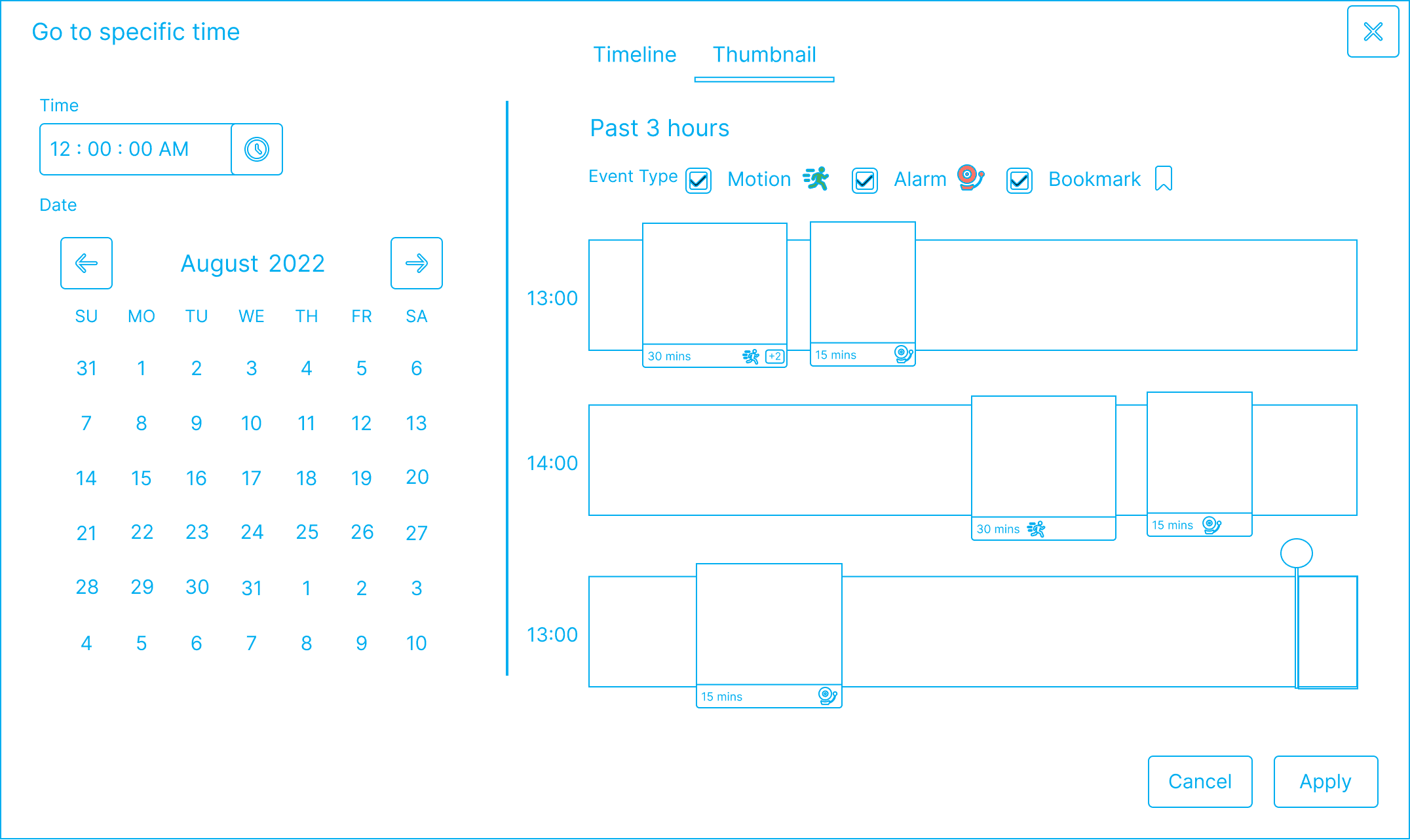
One of the key insights from my desktop client research was how the toggle between Timeline and Thumbnail views was easily missed at the bottom of the interface. In my redesign, I addressed this putting at the top and replacing the toggle with tab-based navigation. This will significantly improves discoverability, as well as accomadates for more than two views in the future.
Furthermore, I also incorporated event filters to help users narrow down their search based on event types:
Motion detection (represented by a running icon)
Alarms (represented by a bell icon)
Bookmarks (represented by a bookmark icon)
These filters allow users to focus on specific types of events, further reducing the cognitive load when searching through extensive footage.
High-Fidelity

The high-fidelity version brought the concept to life with proper styling, spacing, and visual hierarchy. While the older desktop client used the Piano Glass design system, I refreshed the looking using Gelato components to maintain consistency with the web application. For components that didn't exist in Gelato yet (like the timeline visualization), I created new elements that followed Gelato's design principles and visual language. I needed to validate them with Gelato Team of UX engineers, but first I need to get this approved with the PM & Dev Lead in the next meeting.
Feedback: Balancing Technical Constraints with User Needs
During the meeting with the PM and Dev Lead, I presented this comprehensive solution. While they appreciated the improved usability, the Dev Lead raised a valid concern:
"Although the thumbnail view provides excellent visual context for exploration, generating thumbnails for every segment would require significant processing power. Servers could potentially struggle with the load, especially for customers with hundreds of cameras."
This technical constraint forced me to reconsider my approach. Rather than implementing the complete thumbnail view as shown, I began exploring alternative solutions that could deliver similar benefits without the performance impact.
Version 2
New Hover state: Combining Timeline & Thumbnail view
My breakthrough came when I considered a hover-based approach: What if thumbnails only appeared when users hovered over specific timeline events?
This approach would:
Maintain the clean, scannable timeline as the default view
Generate thumbnails only on demand when users showed interest in specific segments
Provide the contextual benefits of thumbnails without the processing overhead
Eliminate the need for a separate thumbnail view entirely
Feedback: Better Onboarding
After discussing this approach with other designers and getting some feedback, I realized I needed to address another challenge: the potential for information overload. While the 24-hour timeline provided valuable context, showing it by default might overwhelm users who simply wanted to jump to a specific time.
The UX law of progressive disclosure suggested we should split the interface, making the detailed timeline view secondary and only showing it when needed. This would create a more approachable entry point for all users while still providing power features for those who needed them.
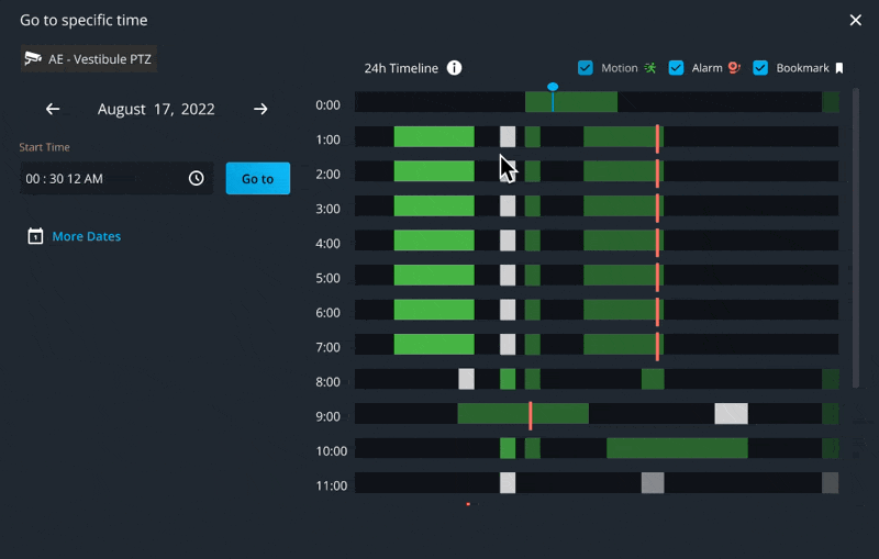
Version 3
Testing Different ways to Alternate Views
Inline Button
Toggle Switch
After testing both ways and gathering feedback, toggle switch proved more effective. The interaction was more intuitive and the ability to remember the user's preference was particularly valuable for regular users who relied on the timeline view frequently.
Version 4
Improving False Flags: Adding Relative motion & Interactive Filters
Looking back at false flags, if smart homeowners get annoyed by a handful of false alerts per day, enterprise users dealing with extensive camera networks may face this problem at a much larger scale. By visually relative motion intensity through varying bar heights, we could help security professionals quickly distinguish between minor movement (like the cat in Ring's example) and significant activity warranting investigation.
To further enhance the exploration experience, I made the event filters interactive. When users click on a filter type in the legend, the timeline updates to show only those events, making it easier to focus on specific types of activity.
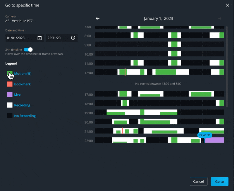
Edge Case: No recording
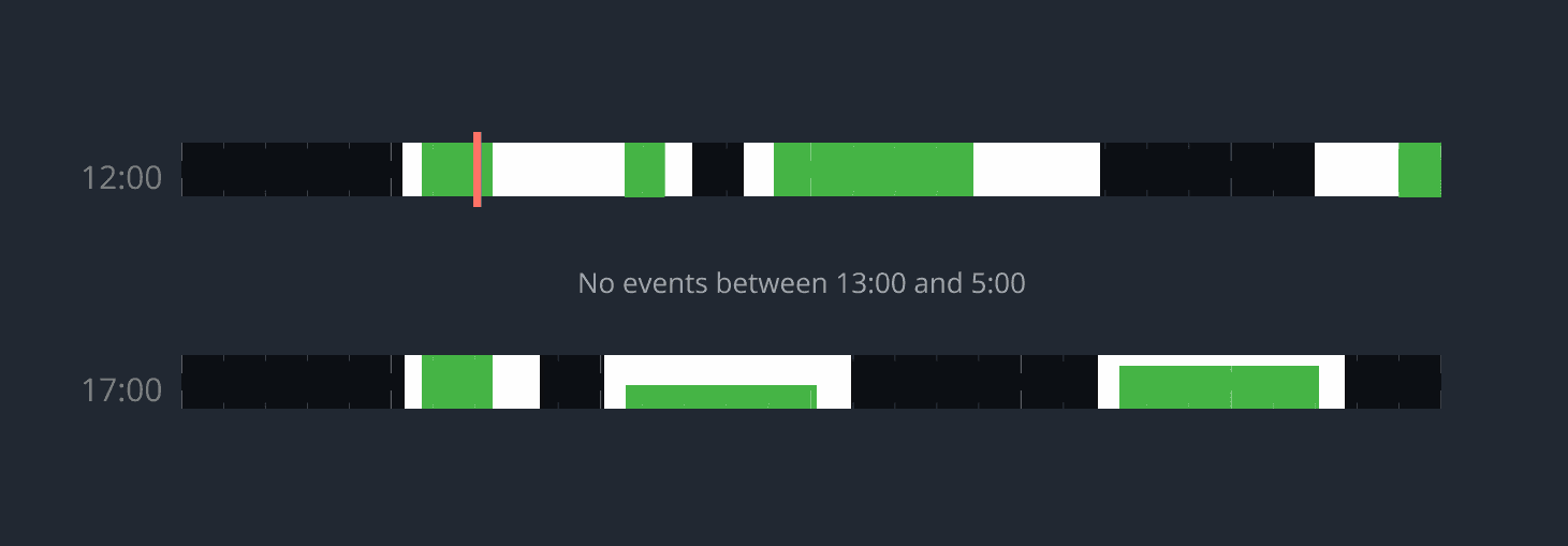
During development, we also identified and addressed an important edge case: hours with no recordings. This more of a common occurrence than I have previously thought. After speaking to the PM and Dev Lead, they mentioned that some cameras may be operational only during business hours. Therefore, rather than showing redundant info such as several rows of black bars which might confuse users, I added clear messaging, saving the operator time when investigating.
Getting featured on Genetec ™ Web App User Guide
Seeing our redesigned "Go to specific time" feature prominently featured in the official Genetec™ Web App User Guide marked a significant milestone for the project. The feature has been integrated into the core navigation instructions under "Navigating to a specific time in playback video," demonstrating its importance to the overall user experience.

🔍 Monitoring & Continuous Improvement
Since this was implemented in the web app rather than the desktop client, we have the advantage of being able to track user engagement with the new features. Initial data from our first month shows promising trends.
However, we need more time and a larger sample size before drawing definitive conclusions about the feature's impact. We can monitor the following metrics over the next months:
User engagement with timeline vs. direct time input
Time spent navigating through archives
Support ticket volume related to archive navigation
User feedback through in-app surveys
This longer-term evaluation will provide more reliable insights into how the feature is performing in real-world conditions across our diverse customer base and use cases.
Throughout the design process, I explored other concepts that ultimately didn't make it into the final implementation. These ideas, while promising, were set aside due to technical constraints, timeline considerations, or user experience priorities.
Hover State: Video Preview
One exciting concept was to enhance the hover state with actual video preview playback instead of static thumbnails. This would have allowed users to see brief motion clips directly while hovering over timeline events, providing even richer context before navigating to a specific moment.

While technically feasible, this feature would have required significant video processing resources and potentially created latency issues for users with slower connections. After discussing with the Dev Lead, we decided to prioritize responsive performance over this enhanced preview capability.
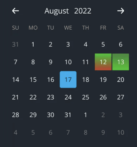
Heat map in Calendar Preview
Another concept I was testing was integrating a heat map visualization directly into the calendar view. The calendar would use colour gradients to indicate activity levels with green representing motion events and possibly red representing bookmarks.
Conclusion
What began as a simple request to add seconds-level precision evolved into a comprehensive redesign that transformed how security professionals interact with archived footage. By deeply understanding user needs, I was able to advocate for a more ambitious vision that addressed both immediate requirements and underlying challenges.
The opportunity to reshape the product roadmap demonstrated how UX Designers can turn minor enhancements into significant improvements by championing truly user-centered solutions.
This success wouldn't have been possible without my amazing team. Our Product Manager's openness to exploring broader solutions, our Dev Lead's technical insights, and my fellow designers' invaluable feedback created a collaborative environment.